
When we have a bunch of data, we must organize and visualize it in order to make sense of it. Hans Rosling, a Swedish doctor, mathematician, and professor, has a great video showing one of the earliest methods used to visualize data.
A standard way to visualize categorical data is by finding the frequency of different occurrences. For example, let’s say we have a random sample of 50 statistics students and the country in which they live.
Dataset: country
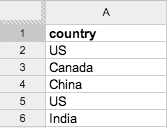
(first six rows)
In this spreadsheet, each row represents one student (except Row 1, which is the header). For example, the student represented by Row 2 is from the United States.
If we want to know the most common country in which statistics students live, we should make a frequency table by counting the number of occurrences of each country, e.g.
| Country | Frequency |
| China | 12 |
| US | 10 |
| India | 8 |
| Japan | 8 |
| Germany | 3 |
| Mexico | 3 |
| Other | 6 |
We can do this manually, or use a statistical program. Let’s see how it’s done using R.
This is a preview of Lesson 2. To access the full book, please purchase a hard copy or a digital version. If you opt for the digital version, you will receive a link via email within 1 business day.
Continue to Lesson 3, or select a lesson below.
Lesson 1: Introduction to Statistical Research Methods
Lesson 2: Visualizing Data
Lesson 3: Central Tendency
Lesson 4: Variability
Lesson 5: Standardizing
Lesson 6: Normal Distribution
Lesson 7: Sampling Distributions
Lesson 8: Estimation
Lesson 9: Hypothesis Testing
Lesson 10: t-Tests for Dependent Samples
Lesson 11: t-Tests for Independent Samples
Lesson 12: Intro to One-Way ANOVA
Lesson 13: One-Way ANOVA: Test significance of differences
Lesson 14: Correlation
Lesson 15: Linear Regression
Lesson 16: Chi-Squared Tests
Afterward
Index