
Keep the standard deviation in the back of your head for the time being, and let’s move on to a different but related question. If you know a particular value, how can you describe how this value compares to others in the dataset?
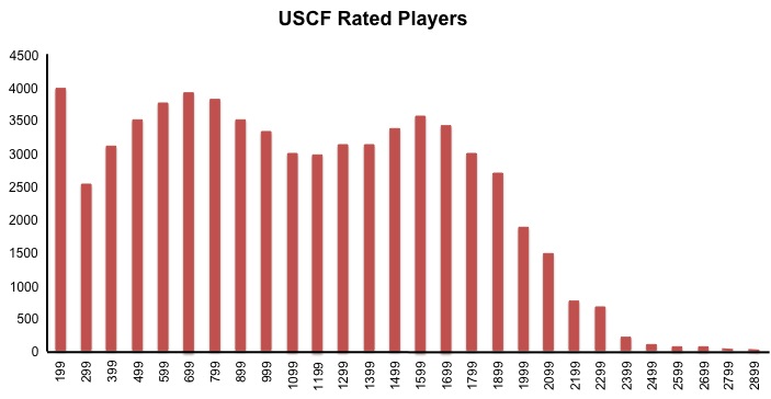
For example, Katie plays competitive chess, and her United States Chess Federation rating is 1800. We know that the higher the number, the better the rating. But just how good is a rating of 1800? We could say that Katie’s rating is lower than 8110 other chess players, but we don’t know how many chess players exist in total.
A more descriptive way to compare a rating of 1800 to other ratings is to look at the distribution of ratings of other US players.
Now we can clearly see that a rating of 1800 is higher than most rated chess players in the US (approximately 88%).
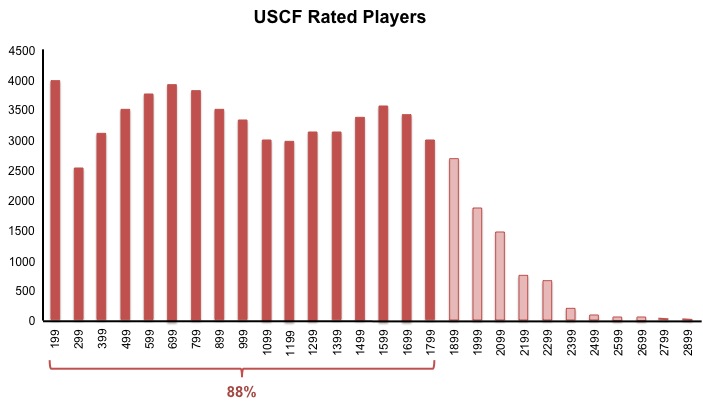
In this case, we get 88% by adding all the absolute frequencies for each bin up to a rating of 1800, and then dividing by the total number of chess players. It’s easier to analyze proportions and percentages using relative, rather than absolute, frequencies. In the course, we used Facebook friends as an example. (The number of Facebook friends that users have is not normally distributed, but let’s pretend it is for the sake of demonstration.)
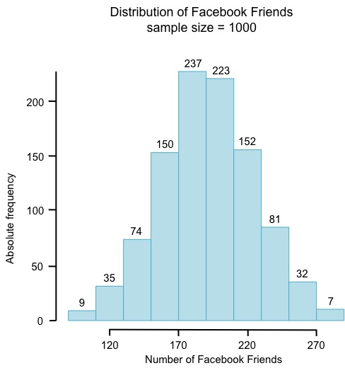
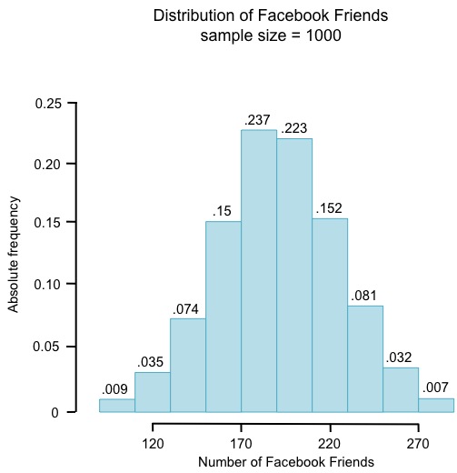
The histogram on the left shows absolute frequencies; the histogram on the right shows relative frequencies for the same data.
Now we can more easily know things like whether or not a certain number of Facebook friends is high or low in comparison to others, or how many Facebook friends the majority of people in the sample have. It looks like most people in this sample have between 170 and 210 Facebook friends. What proportion is this?
What about the proportion of people who have between 180 and 210 Facebook friends?
In this case, it’s impossible to tell using this histogram with these particular bin sizes. Recall from Lesson 2 that if we increase the bin size, we lose precision. We could simply decrease the bin size, but if we decrease it too much, we won’t be able to see the shape of the distribution.
All data has some sort of shape, but many are of a particular shape that we can model with a smooth a theoretical distribution. The one we use most in this course is the normal distribution, also known as the bell curve.
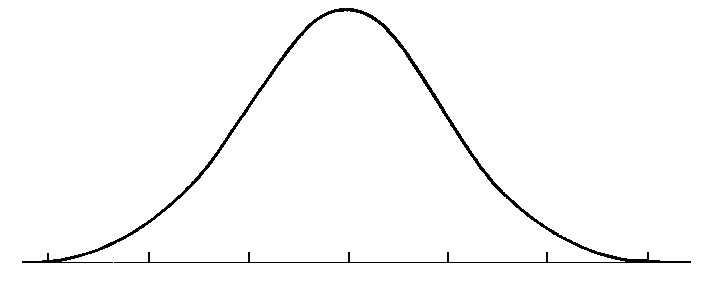
This theoretical distribution is perfectly symmetrical because the mean, median, and mode are all equal.
This is a preview of Lesson 5. To access the full book, please purchase a hard copy or a digital version. If you opt for the digital version, you will receive a link via email within 1 business day.
Continue to Lesson 6, or select a lesson below.
Lesson 1: Introduction to Statistical Research Methods
Lesson 2: Visualizing Data
Lesson 3: Central Tendency
Lesson 4: Variability
Lesson 5: Standardizing
Lesson 6: Normal Distribution
Lesson 7: Sampling Distributions
Lesson 8: Estimation
Lesson 9: Hypothesis Testing
Lesson 10: t-Tests for Dependent Samples
Lesson 11: t-Tests for Independent Samples
Lesson 12: Intro to One-Way ANOVA
Lesson 13: One-Way ANOVA: Test significance of differences
Lesson 14: Correlation
Lesson 15: Linear Regression
Lesson 16: Chi-Squared Tests
Afterward
Index
This is one of the best stats courses online.Thanks for all the content.